Colour in Web Design: Beyond Preference
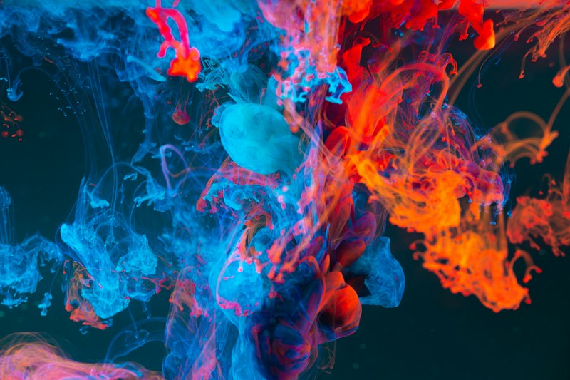
Colour is rarely arbitrary in effective design. It communicates brand personality, directs attention, conveys meaning, and affects emotional responses. Understanding colour psychology gives designers evidence-based tools for making colour decisions that serve both aesthetic and functional goals. Design Agency creates brand colour systems grounded in colour psychology for clients.
Colour Associations and Meaning
Blue: Trust, reliability, calm, professionalism. Why banking, technology, and healthcare brands default to blue — it reduces perceived risk.
Red: Energy, urgency, passion, danger. CTAs in red create urgency. Too much red creates anxiety. Used strategically for sale banners and error states.
Green: Growth, health, nature, success. Natural fit for financial ("your money is growing"), environmental, and wellness brands. Universal association with success and go-ahead.
Orange: Warmth, energy, enthusiasm, affordability. Approachable without the aggression of red. Common for value brands and CTAs (creates urgency without alarm).
Purple: Luxury, creativity, wisdom, mystery. Historically associated with royalty. Used for premium positioning and creative industries.
Black: Sophistication, luxury, power, elegance. Dominant in fashion, luxury goods, and premium technology.
White: Cleanliness, simplicity, openness, possibility. Creates space and focus. Dominant in healthcare and minimalist design.
Colour and Accessibility
WCAG 2.1 requires minimum contrast ratios:
- Normal text — 4.5:1 contrast ratio minimum
- Large text (18px+ or 14px+ bold) — 3:1 contrast ratio
- UI components and graphical objects — 3:1 contrast ratio
Test with tools like WebAIM Contrast Checker or the browser DevTools accessibility panel.
Cultural Colour Context
Colour meaning is not universal:
- White = purity in Western culture, mourning in some Eastern cultures
- Red = danger in the West, luck and prosperity in China
- Green = environmental in Western markets, religious significance in Islamic cultures
Design Agency Group conducts brand research that includes cultural context when selecting colour for international brands.

Topics
Need Professional Design & Marketing Help?
Work with award-winning creative agencies that bring strategy, design, and digital expertise together.
Σχετικά Άρθρα
Όλα τα άρθρα
WordPress in 2026: The Complete Guide for Businesses
WordPress powers over 40% of the web. Learn how to choose themes, plugins, and build a high-performance WordPress site that ranks and converts.

E-Shop Development: Building Online Stores That Convert
A great e-shop combines beautiful design with conversion-focused architecture. Learn the platforms, design principles, and optimizations that drive online sales.

Responsive Web Design: Building for Every Screen in 2026
With mobile devices generating over 60% of web traffic, responsive design is not optional. Learn the principles, techniques, and testing approaches that ensure great experiences on every device.