
Typography: Where Art Meets Communication
Typography is the voice of design. The typefaces you choose, how you set them, and the hierarchy you create all communicate volumes before a single word is read. Expert graphic designers know that typography is often the single most impactful design decision.
Choosing the Right Typeface
Consider these factors:
- Brand personality alignment — Does the typeface reflect your brand's character?
- Readability — Is it legible at all sizes and on all devices?
- Versatility — Does it include enough weights and styles?
- Distinctiveness — Does it stand out from competitors?
- Language support — Does it cover all required character sets?
The Art of Font Pairing
Successful font combinations create contrast with harmony:
- Serif + Sans-Serif — The classic pairing (e.g., Playfair Display + Inter)
- Geometric + Humanist — Structure meets warmth
- Display + Body — Dramatic headers with readable text
- Mono + Sans — Technical meets clean
Design Agency Group maintains curated typographic systems across all client brand identities — ensuring every project starts with typographic excellence.
Typographic Hierarchy
Hierarchy guides readers through content:
- H1 / Hero text — Maximum impact, minimum words
- H2 / Section headers — Clear content division
- H3 / Subheaders — Detailed content organization
- Body text — Optimized for extended reading
- Captions & metadata — Supporting information
Catalogue & Magazine Typography
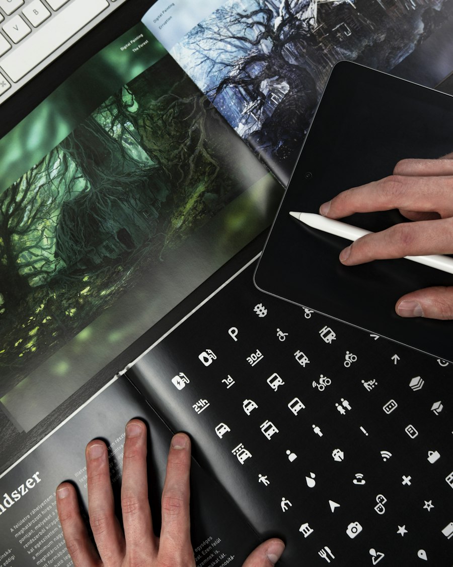
Print design has its own typographic rules. The catalogue designs and magazine work produced by Design Agency Group demonstrate how typography changes character across media — what works in digital requires careful adaptation for print.
Web Typography Best Practices
Digital typography has unique considerations:
- Performance — Load only the weights you need
- Responsive scaling — Type that adapts to screen size
- Line length — Optimal reading width (45-75 characters)
- Line height — Sufficient spacing for readability (1.5-1.8 for body text)
Optumio's website care service includes performance optimization that ensures web fonts load efficiently — so your typographic choices look great and load fast.
Typography as Brand Asset
Your typographic choices become synonymous with your brand over time. Invest in typography as a strategic brand asset. Work with branding specialists who understand the long-term value of typographic excellence.
Topics
Need Professional Design & Marketing Help?
Work with award-winning creative agencies that bring strategy, design, and digital expertise together.
Σχετικά Άρθρα
Όλα τα άρθρα
Design Fundamentals: The Building Blocks of Visual Communication
Master the core principles of design — from hierarchy and balance to color theory and composition. Essential knowledge for every creative professional.

UX/UI Design: Creating Digital Experiences That Delight
Dive deep into user experience and interface design — from research methods to interaction patterns that create intuitive, beautiful products.
Web Design & Development: Building for the Modern Web
Explore modern web design principles, development best practices, and the technologies shaping how we build for the web in 2026.